Several times faster online store
Stokker
Stokker is the leading sales and service company for professional tools and machinery in the Baltics.
Stokker's five different domains receive a combined average of 3,000–4,000 visitors per day. At the peak of the season, however, visitor numbers can reach up to 10,000 per day.
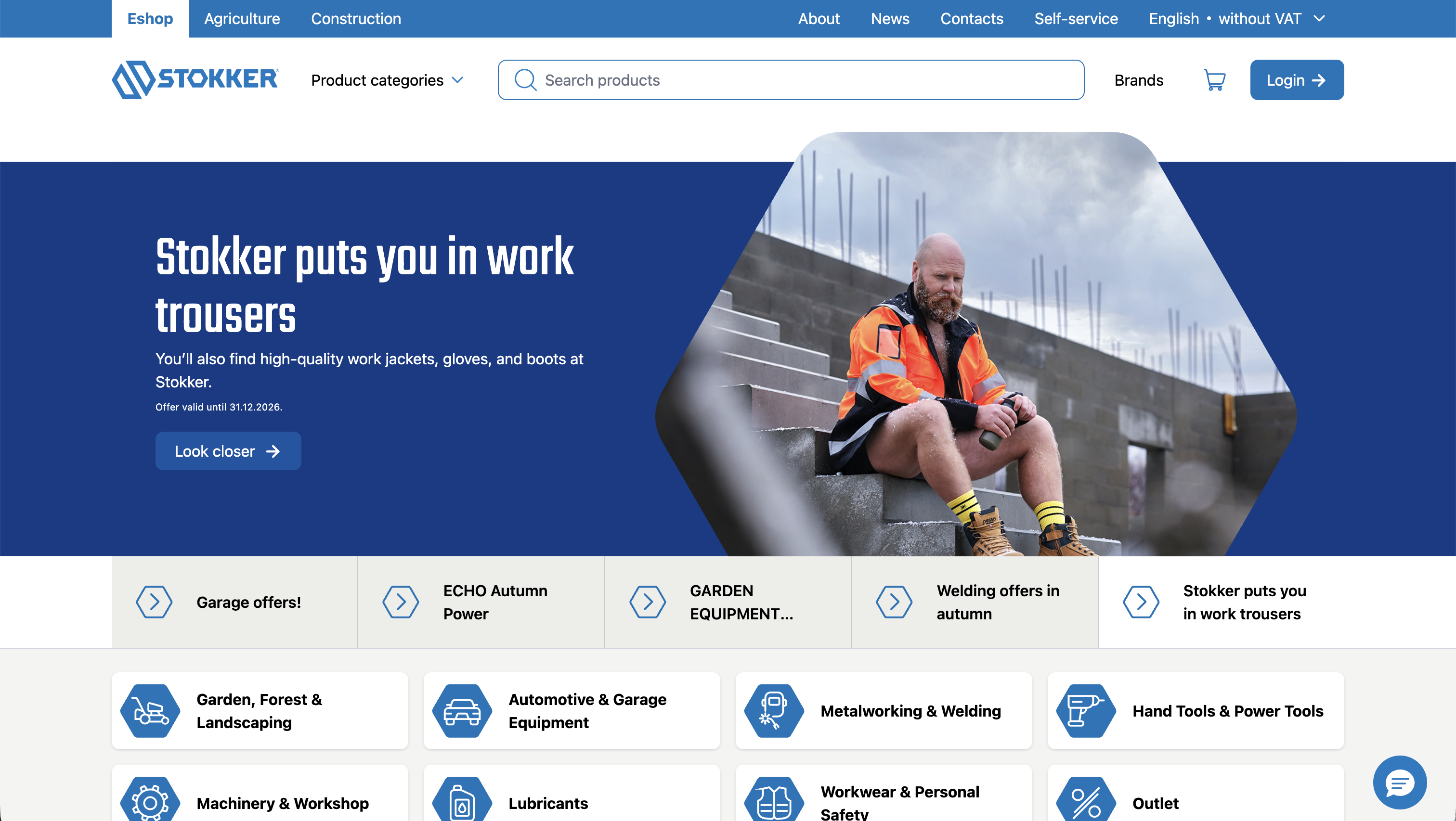
Image of the new site
Goal
Previously, the Stokker online store used a React-based user interface. The store worked, but it had both visual and performance issues.
Our goal was to make the online store faster and more user-friendly, while also improving its visual side. We started the work in February, and it was important to get the new store ready for the spring season.
On the visual side, we collaborated with the design agency reThink, who created new designs in Figma. The design process was collaborative — taking into account both Stokker's wishes and our feedback — and our task was to implement these designs in the online store.
After analyzing the existing code and discussing the needs with Stokker, we concluded that instead of fixing the existing application, it made more sense to rewrite the user interface completely. This allowed us to start with a clean slate and make architectural decisions right away based on the new goal.
Rewrite
We rewrote the entire user interface from React to Svelte.
Starting from scratch gave us the opportunity to rethink the entire page-loading process. The goal wasn't simply to copy the old application with new technology, but to reconsider what work should be done by the server, what by the browser, and what information the user actually needs on the first load of the page.
An important part of this was also improving SEO. The store has thousands of products and over a hundred categories, and it's important that these are easily readable and quickly accessible to search engines.
Server or browser?
One of the first questions with the new architecture was when and where to load the data. It doesn't make sense to prepare everything on the server, but likewise it's not reasonable to send the entire application along with large amounts of data to the browser and let the user's computer do the rest of the work.
On the first load of the page, we render on the server the information the user needs to see immediately. This way, important content reaches the browser as quickly as possible, and search engines can immediately understand the page's content. The more interactive parts, dependent on user actions, are then loaded on the client side — for example, there's no point sending the shopping cart logic along with the initial HTML if the user hasn't added anything to the cart yet.
This division makes it possible to reduce the initial load size and avoid a situation where the browser has to do all the work to display the web page.
Less JavaScript
Svelte was a great help in implementing this division. Unlike many other frameworks, Svelte doesn't bundle all of the application's logic into one large JavaScript package that is sent to the user as a whole. Instead, Svelte compiles each component, at build time, into exactly the JavaScript actually needed to keep that specific component running.
This is especially important in an online store, where a single application has many different features: search, filters, shopping cart, user account, news, and much more. Thanks to Svelte's approach, the user doesn't receive all of this functionality at once, but only the code actually needed on the specific page.
The result is a smaller amount of JavaScript for the browser to download, parse, and run — meaning less work for both the network connection and the user's device, so the page loads faster.
Result
The result of the project is a new, beautiful, modern, and fast online store.
The improvement in speed is clearly evident from the load-time comparison. We measured four typical pages on both the old and the new online store, and in every case the new solution was faster.
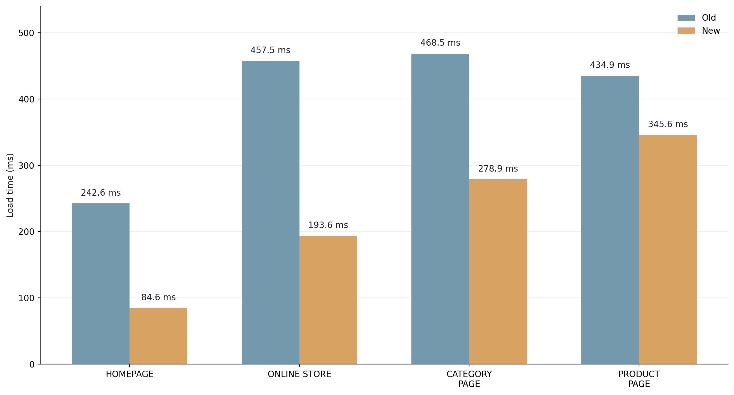
Comparison of load times between the old and the new online store
Other measurable indicators improved as well. Lighthouse's SEO score is 92, and the Accessibility score is also 92, showing that the new online store is not only faster, but also better readable by search engines and more accessible to users.